Project
Beijumi
Role
Research
Wireframing
Usability Studies
Prototyping
Dates
Feb - May 2022
Tools
Figma
Miro
Photoshop
Google Suite
The Problem
It's 1:00 pm and I am leaving the office to grab some lunch. As I approach my favourite market food stall, that predictable thought creeps into my mind "this is going to be a while" as I look at the queue of people snaking around the corner. Surely, these people must have had the same thought at some point. What if there was a better, faster way to buy lunch here...
The Goal
Design an app for Beijumi: an Amazonian food truck at Whitecross Market, London.
Research
I conducted first-hand interviews with customers asking both quantitative questions like, rate your experience out of 10, and qualitative questions like, what did you dislike about your experience?
After surveying the demographics of Beijumi's customer base, I defined their key audience at this time as working professionals on their lunch break; a short-on-time segment that is used to leaning on technological solutions to traditionally manual problems.
The user groups confirmed the assumption that they hated the long queues and wanted a more efficient method of ordering from there.
The research also revealed another category of people who are very nutrition minded who order from there because of the lack of other vegan options at the food market but find the lack of nutritional information frustrating
Personas

PRIMARY
“A quick and delicious lunch from Beijumi is one of the percs of working in the city”
Name: Rob
Age: 32
Occupation: Project Manager
Rob is a Project Manager working in the city. He enjoys cooking but does not like to take leftovers from home for lunch. He found a delicious Brazilian food stall in the market close to work called Beijumi - it is his favourite lunch spot. His biggest frustration is that Beijumi is very popular and always has long queues and he often spends half of his lunch hour just queuing and ordering.

SECONDARY
“I keep track of my calorie intake and I'm a vegan. Finding something quick and delicious can be a challenge”
Name: Julia
Age: 21
Occupation: Financial Analyst
Julia is a Financial Analyst at a big city firm. She's energetic and spends a lot of time in the gym and her smartwatch keeps track of her calorie intake. She is also a vegan and wants to stay on track with her fitness goals. She loves ordering from Beijumi because of their vegan-friendly options but finds it frustrating not knowing the nutritional values of the meals and feels awkward asking about it
User Journey

Click image to expand
Competitor Audit
To create a compelling user experience for our Beijumi app, I needed to check out some competition. However, finding a direct competitor for another food stall was challenging as they are a very niche product. I, therefore, decided to audit three indirect competitors that are established coffee brands with the aim of understanding how easy it was to place an order via their apps and what elements I could be inspired by and use in my own design

Click each image below to expand


Paper Wireframes.
The research has given me some ideas about what is important to the customers and what features from the competitors worked the best. With that, I pencilled in a few possible home screens for the Beijumi app.


Click image to expand
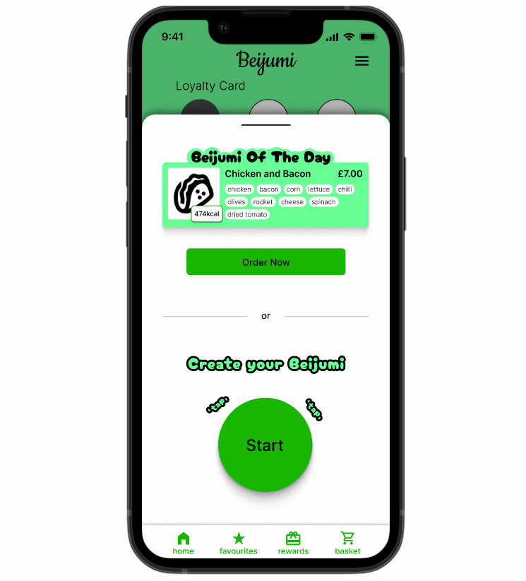
Digital Wireframes
After handpicking the best elements from all the paper wireframes, I had a solid base to work with and convert to a digital wireframe. Figma was the tool of choice from this point onwards.


Click image to expand

Click image to expand
Usability Studies
The Low-Fi prototype flow is complete and needed to be tested by several target users for me to understand whether my design meets the criteria. I narrowed down the results to the three, most critical findings

FINDING #1
It has been observed that most users expressed the need to have more information in the cart about the ingredients they have picked in the building stage. They wanted to see some confirmation that shows what ingredients they have selected
Supporting evidence: 4 out of 5 participants made a comment about seeing the full breakdown of the order in the Cart
"I want to see what I chose. I forgot what ingredients I've already added"
FINDING #2
The 'Add more Items' button confused some participants. It was not clear enough what it meant.
Supporting evidence: 2 out of 5 people were confused by its function
"Add more items? I thought it was adding more ingredients"
FINDING #3
The participants were asked to add their order to Favourites for quick reordering next time. Most participants failed this task
Supporting evidence: 4 out of 5 participants were not able to work out how adding to favourites works
"I was expecting the favourites button to be in the basket somewhere"

Style Guide


