Project
Social Builder
Role
Research
Wireframing
Usability Studies
Prototyping
Dates
Nov 2022 -
Jan 2023
Tools
Figma
Miro
Photoshop
Google Suite

The Problem
A new charity organization wants a solution that matches trade professionals and construction projects worldwide in countries where natural disasters and wars have devastated livelihoods. This non-profit project will allow trade professionals to donate their time to help rebuild homes for the most vulnerable people.
The Goal
Create an app and a matching website that looks great and feels familiar on all screen sizes.
Research
The research was conducted via an online survey to understand whether a Social Builder platform was needed in the first place. We asked a mixture of qualitative and quantitative questions such as if you could donate your time and skills to help people in need, on a scale of 1 to 10 please tell us how likely you would be willing to do this and would you travel abroad for a construction project?
The research has revealed a primary user group, young males between 21-50 years of age
The user groups confirmed the assumption that people are interested in donating skills rather than money for a worthy cause.
The research also revealed another category of people - construction business owners who would b willing to donate some of their workforce for a worthy cause.
Initial pain points were discovered:
Pain points
Not knowing where to find out information about which countries need what aid
Not knowing how to arrange a visit to a foreign construction site
Not knowing where to stay and whether it is safe
Not being informed about what work was already done on the construction site
Personas

PRIMARY
Name: Steve
Age: 33
Occupation: Plumber
"I feel like my skills would be useful in places of humanitarian crisis. These people have lost everything. I wish there was a way I could go out there and help"
Steve is an experienced plumber who feels he can help the most desperate communities with his skills. He needs a platform where he can easily find projects that match his skill set. Additionally, he wants the platform to help him organize the trip as easily as booking a holiday abroad. Since this is a voluntary project, he would also like to have a way to raise funds to aid him in his travels and expenses.

SECONDARY
Name: Emma
Age: 49
Occupation: Business Owner
“As a company, we have the experience to help rebuild hospitals and homes for the people in separate situations but it is hard dedicating resources that won't affect our business. I wish there was a way we could send some employees without it affecting us too much financially”
Emma owns a construction company and she knows she has the resources that can help rebuild communities that have been damaged by natural disasters. Her biggest frustration is the lack of government-backed schemes her company can participate in to help fund the work in these areas. She would be happy to send some of her employees to these countries if the government helped to fund and organise these projects.
User Journey

Competitor Audit
At the time of research, there was no other competitor that achieved or was aiming to achieve what Social Builder aimed to create. Therefore I had to look at indirect competitors that had platforms with features I could use as inspiration to develop the Social Builder platform.
GoFundMe, Airbnb, and Lonely Planet were chosen for this audit.
GoFundMe is one of the most popular charitable crowdfunding platforms. I chose them to understand how easy it was to set up a funding campaign.
Airbnb is the most popular home-hosting platform with a beautiful UI and exceptional user experience. The platform offers a huge amount of variety of homes to stay in and sorts them into clever categories that are useful to customers. I chose them to understand how they present all the information in a clear and easy-to-understand manner.
Lonely Planet is a well-known travel information site. I chose them to see what relevant information they include and how easy it is to find it on their website


Paper Wireframes
For this project, the challenge was to adopt a mobile-first approach, therefore I started my paper wireframes by designing for a mobile app first and then expanding to a larger screen


Digital Wireframes
After handpicking the best elements from all the paper wireframes, I had a solid base to work with and convert to two sets of digital wireframes (For the desktop and mobile experiences). Figma was the tool of choice from this point onwards.
MOBILE
WIREFRAMES
The Home Screen of the mobile app digital wireframe remained almost identical to my proposed paper wireframe with one small change. During digital wireframing it was apparent that the user has no way of exploring all the projects easily therefore I have made a decision to replace the 'Register' button with 'Explore the Projects' button. Most users who are used to using digital apps would look for the 'Register' button by clicking on the Avatar icon at the top of the screen - that is where the 'Register' option will be moved.
For this app I wanted to explore the full user journey of finding a project to work on, including the welcome and registering screens as these will be crucial components of the user journey


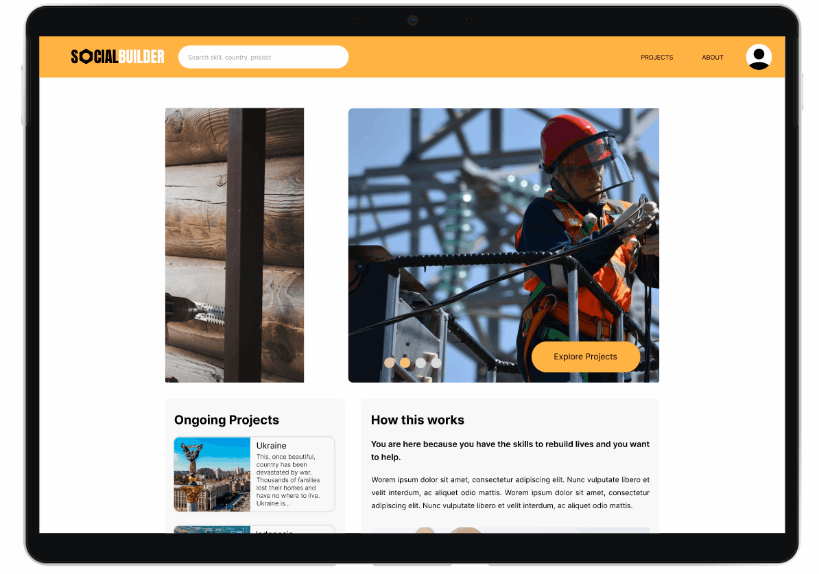
DESKTOP
WIREFRAMES
The desktop website borrows heavily from the mobile app design in terms of feel and navigation, however, the bigger screen allows for more content to be displayed and some features work better on a website format. For instance, the website does not have a separate Welcome and Registration screens, these are included on the Home Screen as pop-ups.
The rest of the design focuses on using the wider format of the website to present more information to the user that requires less scrolling.
MOBILE APP

DESKTOP WEBSITE

Usability Studies
The Low-Fi prototype flow is complete and needed to be tested by several target users in order for me to understand whether my design meets the criteria. Several important conclusions were found that make a difference for the user experience.

FINDING #1
The participants were not well enough informed between the application stage and commitment stage
Supporting evidence: 5 out of 5 participants have stated on the survey that they need to learn a lot more about the project
"Oh, I committed already? I thought there was going to be more information in-between"
FINDING #2
Most participants did not understand how traveling and accommodation was being organized
Supporting evidence: 4 out of 5 people were concerned about travel and accommodation. Not enough information is available for them to understand the logistics.
"How does accommodation work? Do I need to find my own hotel?"
FINDING #3
The project dates are causing confusion
Supporting evidence: 4 out of 5 participants made a comment about the dates not being clear enough
"How do the dates work? Dates by month are a little vague. I cannot commit for a whole month"
Style Guide

Hi-Fi Prototype
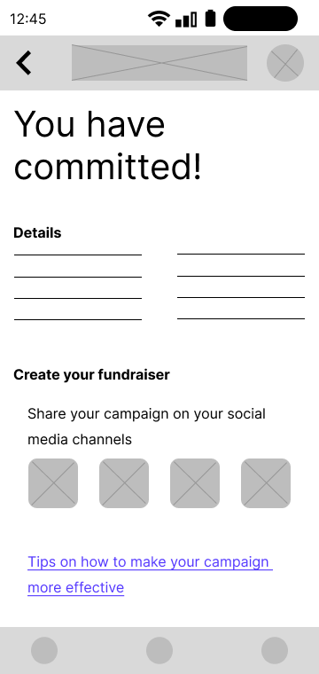
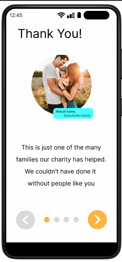
Based on the first Usability Study, conclusions were made that the biggest issue with the Lo-Fi Prototype was delivering information in a clear and relevant way. None of the participants could confidently say they knew what they were signing up for therefore the Hi-Fi prototypes needed to contain a lot more detail for context.
MOBILE APP EXPERIENCE
Improvements
Added interactions that take advantage of the mobile format
Added an expandable 'project timeline' for the user to understand at what stage this project is
Added an additional flow for creating an account that takes into account adding skills and interests
A fully detailed mockup of the Project Information screen
Added an addional flow to explain how crowdfunding works
DESKTOP EXPERIENCE
Improvements
All the improvements made on the mobile app have been carried over to the Desktop experience.
Unique animations that take advantage of the 'mouse hover' environment available on desktops and laptops.