Project
BigPicture
Role
Research
Wireframing
Usability Studies
Prototyping
Dates
June - Aug 2022
Tools
Adobe XD
Miro
Photoshop
Google Suite

The Problem
BigPicture is a well-known chain of Cinemas in the UK. Their customers would like to pre-book their tickets so they don't have to queue up at the till as its the main source of frustration for the customers
The Goal
The goal is to create a responsive website that looks great on large and small screens without sacrificing features or functionality.
Research
The research was done at one of the BigPicture cinemas by interviewing customers queuing up to purchase a ticket. We asked a series of short questions such as when How long does it usually take you to order the tickets? and What frustrates you the most when you are buying cinema tickets and/or snacks?
After surveying the demographics of BigPicture's customer base, I defined their key audience at this time as young adults up to 40 years of age; a tech-savvy generation who are happy to try technological solutions to save time at every opportunity
The user groups confirmed the assumption that online ticket booking is a cumbersome process and is tailored for a large screen monitor. Most customers are not near a computer when they go to the pictures.
The research also revealed another category of people - parents with young kids. Children are typically not great at queueing which makes the experience for the parent somewhat overwhelming.
Personas

PRIMARY
Name: Mo
Age: 29
Occupation: Pharmacist
"I love visits to the cinema. Nothing beats the big screen experience and I would love an easy way to book tickets spontaneously"
Mo is a healthcare professional who enjoys going to the cinema to experience the latest blockbusters. He needs a website to order his tickets on the go as he find is hard to plan his visits to the cinema and he tends to do them spontaneously. He doesn't like wasting time in a queue but is particular about where he sits.

SECONDARY
Name: Lucy
Age: 35
Occupation: Business Analyst
“I love taking my two little kids to the cinema, but they can be quite a handful and impatient when the queue at the cinema is long. I would love to be able to pre-book in advance and just arrive and enjoy the film”
Lucy is a Business Analyst and has 2 small children. She loves spending time with her children and they love trips to the cinema. Getting the kids to behave while standing in the queue to get tickets and snacks can be a challenge. She would love to be able to prebook everything in advance before heading out to the cinema with the children so that they don't get bored and impatient while mommy does the boring stuff.
User Journey

Competitor Audit
The aim of this competitor audit is to understand how their ticket-booking platforms work, paying closer attention to the mobile experience. Fortunately, the availability of competitors in the UK is wide and so it was relatively straightforward to research two direct and one indirect competitors.
The competitors I have chosen to research are Odeon, Everyman and Disney+. The former two are direct and Disney+ is indirect.


Paper Wireframes
The research has given me some ideas about what is important to the customers and what features from the competitors worked the best. With that, I pencilled in a few possible home screens for the BigPicture app


Digital Wireframes
After handpicking the best elements from all the paper wireframes, I had a solid base to work with and convert to two sets of digital wireframes (For the desktop and mobile experiences). Adobe XD was the tool of choice from this point onwards.


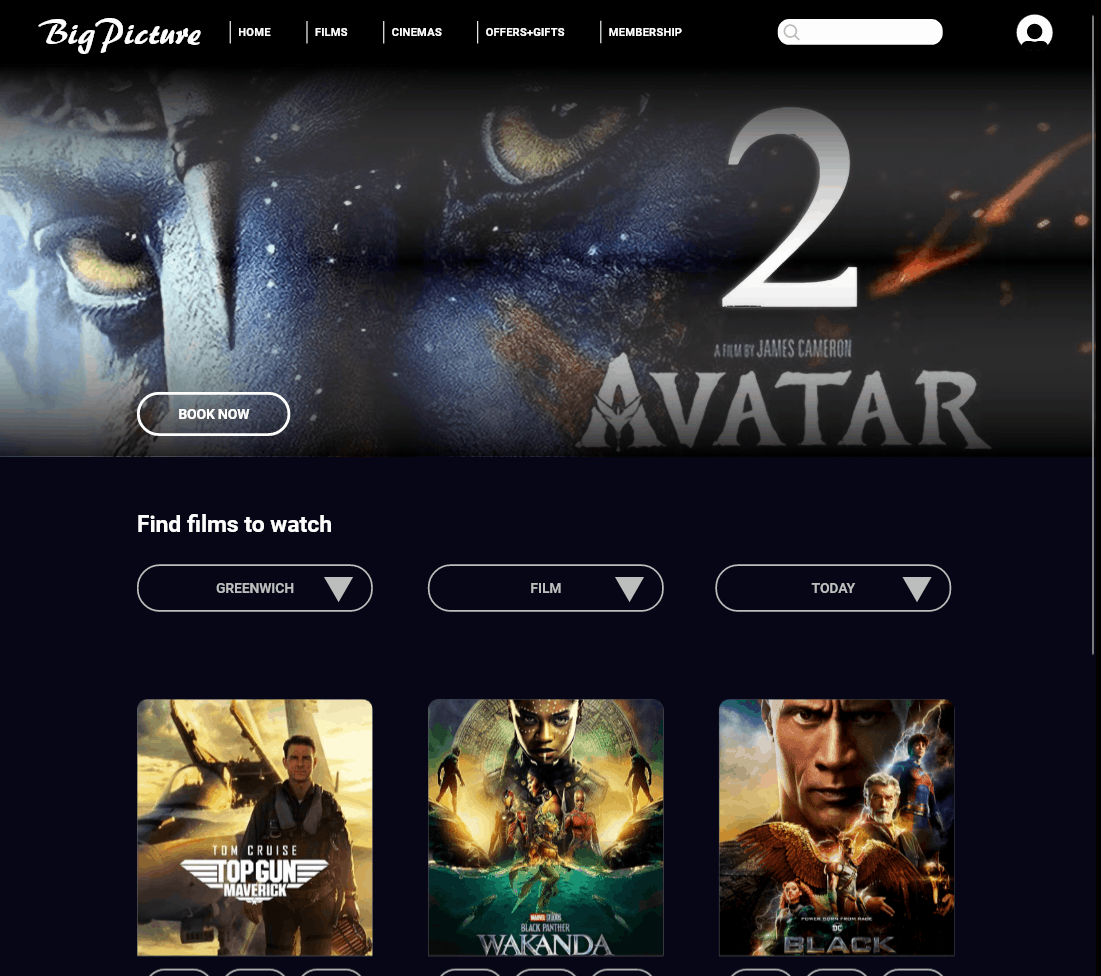
DESKTOP
WIREFRAMES
The digital Home Page wireframe remained almost identical to the paper wireframe with some minor cosmetical adjustments such as having a search bar in the navigation bar instead of a search button
The subsequent digital wireframes demonstrate the booking process. I have opted for a popout design to make the site feel light and bring the user's attention to one area of the screen so they know they don't have to search a wide area with their eyes to find the next button/option.
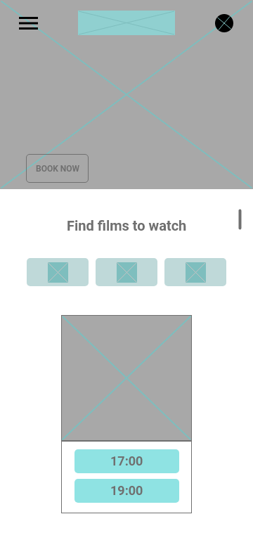
MOBILE
WIREFRAMES
The mobile digital Home Page also remains mostly true to the original paper wireframe. One distinct change I have made here is the 'filtering' menu - I've decided to go for a simpler design and give the user buttons instead of a drop-down list to save space on the screen and a less cluttered feel.
The remaining screens follow the same popup design as the Desktop version but adjusted for the mobile proportions


Usability Studies
The Low-Fi prototype flow is complete and needed to be tested by several target users in order for me to understand whether my design meets the criteria. Several important conclusions were found that make a difference for the user experience.

FINDING #1
Most participants did not like the mobile UI. Particularly the popup they see when they enter the booking process. It feels cluttered and makes it harder to use as the area of interaction is smaller.
Supporting evidence: 4 out of 5 participants made a comment about disliking the popup on a mobile screen
"The pop-up to book tickets on a mobile screen feels too small. I will tap on something by accident here"
FINDING #2
The 'seat picking' screen was confusing for some participants. They were not entirely sure how to tell if what they selected is what they are actually getting
Supporting evidence: 3 out of 5 people were confused by its function
"I think there need to be more colours to explain the seats so that I know which seats are free, which seats are taken and which seats I've selected"
FINDING #3
All the participants disliked the location of the 'Add Popcorn' button on the mobile version
Supporting evidence: 5 out of 5 participants made a comment about preferring to have the Add Popcorn button in the same location as on the Desktop version
"I preferred the 'Add Popcorn' button inside the receipt area. It is easy to miss this button here."

Style Guide

DESKTOP EXPERIENCE
Improvements
Reduces scrolling - no need to scroll for time on the film element
A simplified popcorn-adding process
Once logged in, the information displayed is visually more appealing
The confirmation screen now includes more information and more functionality
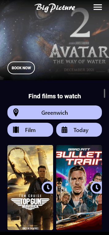
MOBILE EXPERIENCE
Improvements
Removed the pop-up booking window as seen on the Desktop site
Redesigned the ‘available times’ under a film that is more compatible with the mobile format
Films are displayed in 2 rows on the mobile site instead of one. Technically it is possible and visually more appealing.
The majority of the users interviewed did not like the film filtering menu on the home screen. They found it difficult to interpret the buttons by icons alone and needed text to support its functionality. The menu was redesigned to make the buttons more descriptive